We take a look at the 10 best car interiors… ever! After all, it’s what’s inside that counts yeah?
The interior is the most important part of your car. Well, sort of. Obviously it’s imperative to have oodles of power to play with – the more the better, really – and a cunningly tweaked chassis to cope with it, and the right rims and an on-point stance and exterior aesthetics to make other road users ooze with envy… but let’s face it, you’re physically inside the car and you need it to be nice in there. No matter how pretty or quick your ride may be, if it’s got a crap interior it’ll make you sad.
There’s all sorts you can do to spruce up a lacklustre interior, the aftermarket can furnish you with endless options when it comes to seats, steering wheels, audio upgrades, carpets, rollcages, you name it. But some manufacturers got it right from the start. Sometimes a car comes out of the factory with innards so sublime, everyone else wants to copy the idea and stick such things in their own cars. And here, focusing particularly on seats and dashboards, we’ve pulled together our ten favourites, ripe for you to pillage from scrapyards and bolt into your Corsas and Civics…
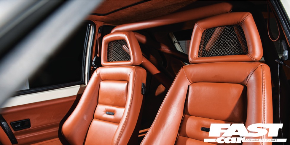
Recaro fishnets
A timeless classic here. The fishnet reference has nothing to do with the stockings your quirky uncle wears to School Disco – see the headrests? They’ve got a mesh in there, that’s why they’re called that. Now, these seats were the absolute daddies through the late-1970s to the 1990s in old-school Fords, and they’ve still got a strong following today. These Recaros appeared in the Mk2 Escort RS2000, replacing the earlier Scheel items, and went on to star in the Mk3 Capri (trimmed in tartan!) and various other models. They’re very much sought after today and change hands for silly money… but we’ve got a little secret for you: the Suzuki Ignis Sport of 2003 had a very similar set of fishnet Recaros, and you can grab those much cheaper. No-one will know the difference and you’ll be a retro hero!
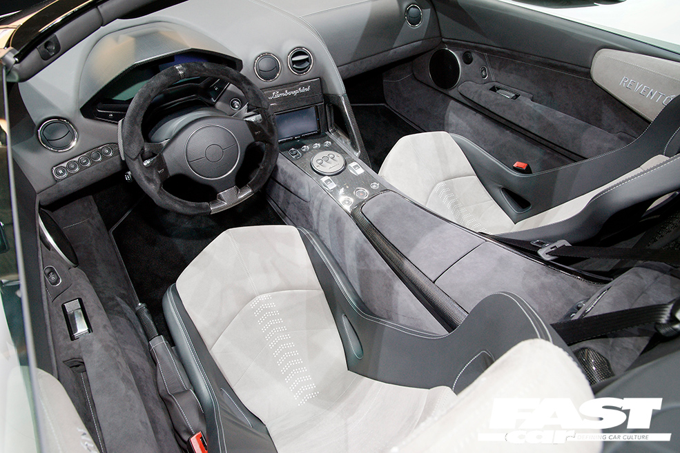
Lamborghini Reventón dash
Hypercars are meant to be silly, that’s the point, and Lamborghini have always been more ostentatious than most when it comes to design. These guys don’t mess about, if there’s an obtuse angle or a jarring juxtaposition of lines to throw in, they’ll do it. But it has to be said that when the limited-run Reventón appeared in 2007, we could only conclude that the design team had all got drunk and watched Top Gun. This Murciélago-based special seemed to think that it actually was a fighter plane, and the dash was the wackiest part. A trio of TFT liquid crystal displays sit inside a carbon-shelled block milled from an aluminium billet, and the digital readouts mimic those of military aircraft, which essentially makes them completely unreadable. A masterpiece of style over substance, they look absolutely awesome, yet are utterly stupid. Presumably they imagined that you’d be driving so fast it’d be pointless looking at the dials anyway.
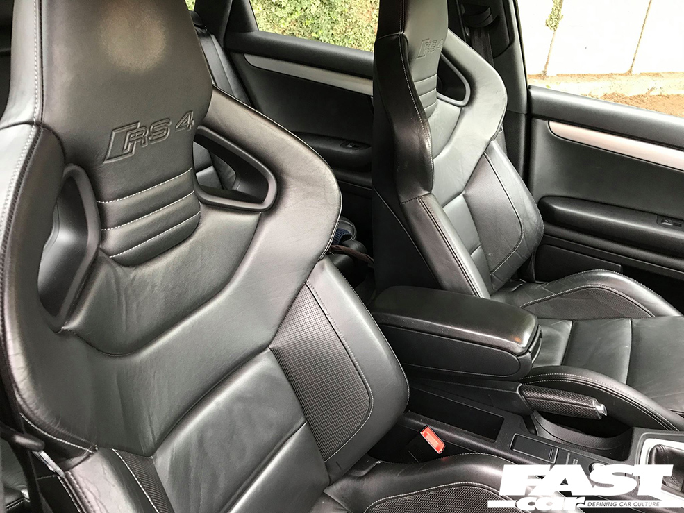
Audi B7 RS4 wingbacks
You know a product has really touched a nerve with the public consciousness when it hits the headlines because people are stealing it to order. Owners of B7-generation Audi RS4s tend to have military-grade security these days, because there was a time when it was perfectly possible that you’d step out of your house one day and find that your pride and joy didn’t have any front seats any more. Why? Well, two reasons. Firstly, they’re heinously expensive – around five years ago the newswires were buzzing with stories of RS4s that had been written off by insurers because dealers were quoting £19,000 to replace the seats. (The light-fingered can stand down though, this isn’t really the case any more. Please don’t go out and steal someone’s chairs, that’s a terrible thing to do.) And secondly – they’re just phenomenal seats. Audi (and Recaro) got these so right – incredibly comfortable on long journeys, yet supremely supportive in enthusiastic driving, and they look awesome too. No wonder so many people cite these as their favourite OEM seats without hesitation. There are few finer places to let out secret farts of joy on twisty roads.
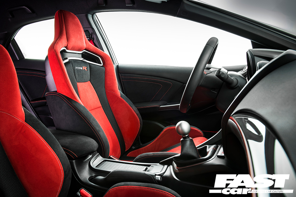
FK2 Honda Civic Type R seats
You’ve got to have red stuff on a Type R, because it’s a Type R. There’s the red badges, of course, and in the case of the FK2 there’s also red seatbelts, red brake callipers, red pinstripes around the wheel rims, red steering wheel detail, the red cam cover, the red mist that descends every time you bury the throttle into the bulkhead… oh yes, and the dials turn red when you press the +R button. And best of all are the red seats. But not because they’re red. Oh no, that’s merely a fringe benefit. The seats in the FK2 Civic are, quite frankly, some of the finest ever crafted by man. Much like the wingbacks in the RS4, these perches do everything – they’ve got massive chunky bolsters that somehow pull off the trick of fitting every driver perfectly regardless of whether they’re stick-thin or a curvy burgerhound; they’re also gorgeously soft and comfy, beautifully supportive, the material they’re trimmed in feels dreamy, and they’re just proper lush. We’d have a set of these in our living room if it wouldn’t herald divorce proceedings.
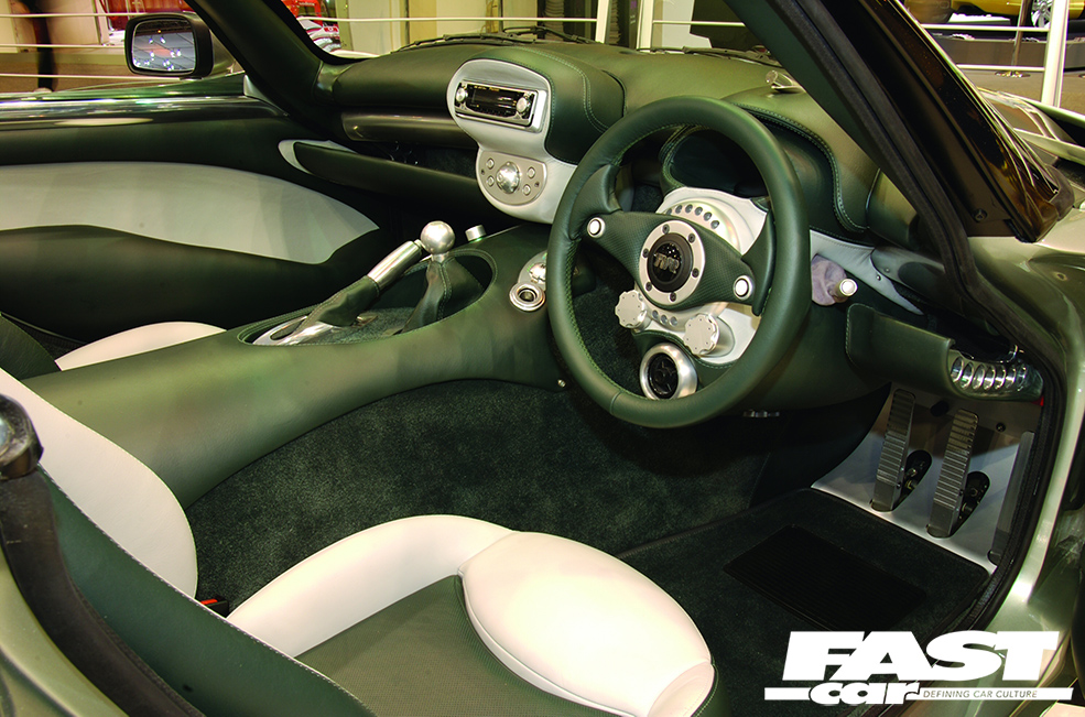
TVR Tuscan dash
TVR are really good at interiors, that’s just a fact. Every model from the 1990s onward had its innards stuffed to the gills with wacky curves and unexpected shapes, all slathered in leather and designed specifically to wow. (As long as you didn’t look at them too closely, that is. The design was incredible, the actual construct wasn’t so hot – inspecting the edges revealed leather that had shrunk and trim that didn’t quite fit, and there was always a faint smell of adhesive.) All the TVRs of this era had incredible interiors – the Griffith, Chimaera, Cerbera, Tamora, T350, Typhon, Sagaris… so why have we singled out the Tuscan? Well, because the dash in this model sums up the entire TVR ethos: wonderful to behold, but actually a bit flaky and prone to failure. You see, the last time we drove a Tuscan we were given very specific instructions as to what to keep an eye on: no more then 2,500rpm is allowed until the oil temperature climbs above 60 degrees; if the water temperature hits 100 degrees, turn the damn thing off and chill out, and so on. But the multi-function digital display can only show one thing at a time, so you spend the entire time clicking the button to flick through various displays rather than paying attention to the fact that you’ve got 400bhp going to the rear wheels along with no traction control, ABS or airbags. …but it looks really cool, doesn’t it?
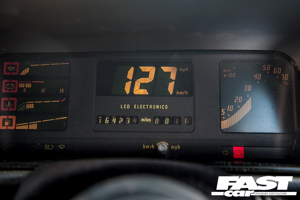
Vauxhall Astra GTE digi-dash
The 1980s were a real golden age of futuristic-looking digital displays. Naturally what was futuristic a few decades ago looks distinctly retro today, but that just gives the digital dashes of the era an entirely new kind of charm. It was probably Knight Rider’s fault – all of those eye-popping LEDs and big-digit numbers. Back to the Future had a hand in all this too. So when Vauxhall put a digi-dash in the Mk2 Astra GTE, it was a real selling point: it had a variety of colours (although mostly yellow, everything was yellow in the eighties), a huge set of digits in the middle as a speedo, a climbing rev counter on the right, and your temps, amps and fuel in racy rows on the left. A fabulous piece of design, and a proper icon of the age as every modder rushed to squeeze one of these into their own car. There was a time when every Nova on the scene had an Astra digi-dash; shave off the corners and it’ll go into a Corsa binnacle, people were putting them in Golfs, Escorts, all sorts. OK, if you wired it in wrong then the speedo would permanently read 288, but in its own way that was also pretty cool.
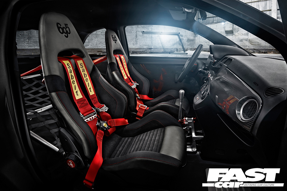
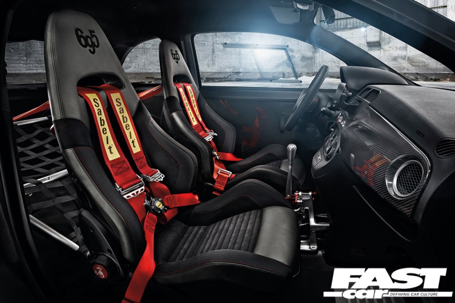
Abarth 695 Competizione Sabelt seats (695 Biposto pictured)
The Fiat 500 has been around for a fair few years now, and there have been so many different spec levels and special editions that it all gets a bit bloody confusing. But one that’s really worth knowing about is the 695 Competizione – unveiled in 2011, this one had Konis, a noisy exhaust with butterflies, a rollcage, an electromechanical gearbox with flappy paddles, and some of the greatest seats ever bolted into a Fiat. Designed and crafted by Sabelt, these god-like bum-snugglers had absolutely massive bolsters for both thighs and flanks, sumptuous leather counterpointed by blood-red Alcantara, carbon fibre shells, and sodding great Abarth scorpions on the windy adjuster knobs. A pretty decent car, but worth buying for the seats alone. And we have to give a special mention to the bonkers Abarth 695 Biposto too, which had a very similar pair of chairs. (‘Biposto’ means ‘two-seater’, and if your car’s named after its seats then they’re probably pretty good!)
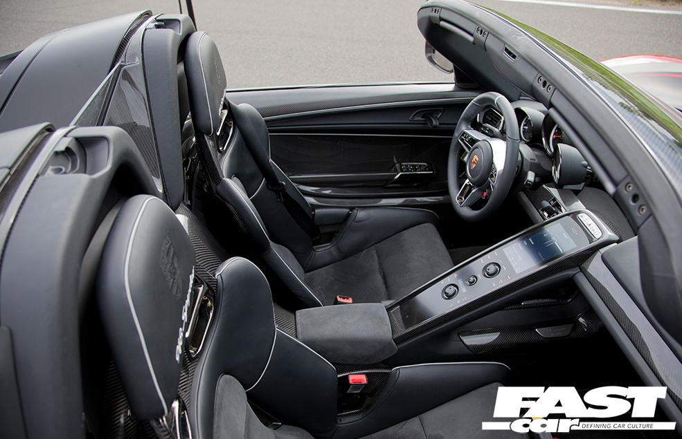
Porsche 918 Spyder seats
When it comes to picking the all-time best car seats, there are an awful lot of contenders from Porsche. Those guys really know a thing or two about crafting items of perfect function and support that also look all kinds of awesome – the tri-colour buckets in the 964 Turbo, the maroon recliners in the G-series 911, the burgundy leather in the 928, anything that came trimmed in Pepita or Pasha fabric… but we had to hand the overall title to the lightweight buckets in the 918 Spyder because, well, just look at them. Gorgeously functional design, skeletal minimalist construction with just enough padding to feel premium, huge embossed Porsche crest on the headrest, mighty harness holes, it’s a dream spec. The lurid neon green piping might not be to everyone’s taste, but they suit the car as it likes to shout about its hybrid credentials by having assorted green shite sprinkled about the place. You’re most likely to find these seats in black, but we much prefer the creamy brown they were offered in. These give you carte blanche to eat Dairy Milk bars in the car and wipe your fingers on the seats without having to worry about the consequences.
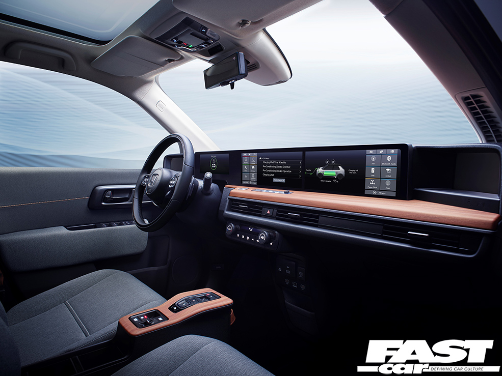
Honda E dash
Electric cars have to have funky dashboards, that’s Tesla’s fault. While there’s a strong argument for making EVs as similar as possible to traditional cars with engines in order to make people actually buy them, Tesla have shaken the interiors game up a bit by fitting a screen that’s slightly too big: a massive iPad-style interface that could happily double up as a dinner tray if you unbolted it. So people expect electric cars to have interesting screens, and Honda have played a bit of a blinder with their new city car, which is called simply ‘E’. A long screen (but not an especially tall one) spans the entire width of the dash, so passengers get to play too, and buttons are kept to a bare minimum to reduce clutter. The really interesting bit is that they’ve counterpointed this hypermodern digital arrangement with a great big slab of wood, like your grandad’s old 1970s Rover. Why? Well, why not?
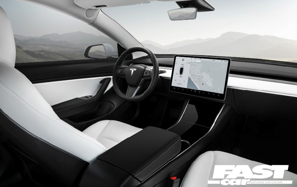
Tesla Model 3 dash
The dash on the new Model 3 is actually really cool. In the Model S (the great big luxury saloon one) and the Model X (the great big SUV one) Tesla insisted on fitting a colossal touchscreen in a portrait orientation in the centre console, which sounds like a great idea on paper and looks cool in design meetings, but is actually a pain in the arse to use because you’re not looking where you’re going if your fingers are jabbing at the lower bits of the screen down by your feet. But the Model 3 flips the screen round to a horizontal position, which makes much more sense, mounting it a bit higher up so you can see it properly. Which is just as well, because get this: there is NOTHING ELSE to look at. Everything is controlled by that touchscreen – not just the audio and the nav, but everything from lights to wipers and even the gearbox. There are no dials above the steering wheel, everything appears on that screen. It’s an amazing piece of design, very user-friendly, although it does suffer from a fatal flaw: if one of your passengers accidentally spills a can of Fanta into it and it stops working, you are totally f*cked. The car is entirely reliant on that screen, and if it doesn’t work, nothing else will either. Still, it looks good, doesn’t it?

